Services05 / 10
UI/UX design
Interface design for websites, apps, dashboards, and portals, shaped around what users need to do and what the business needs them to do next.
What we build
Screens with a reason behind them
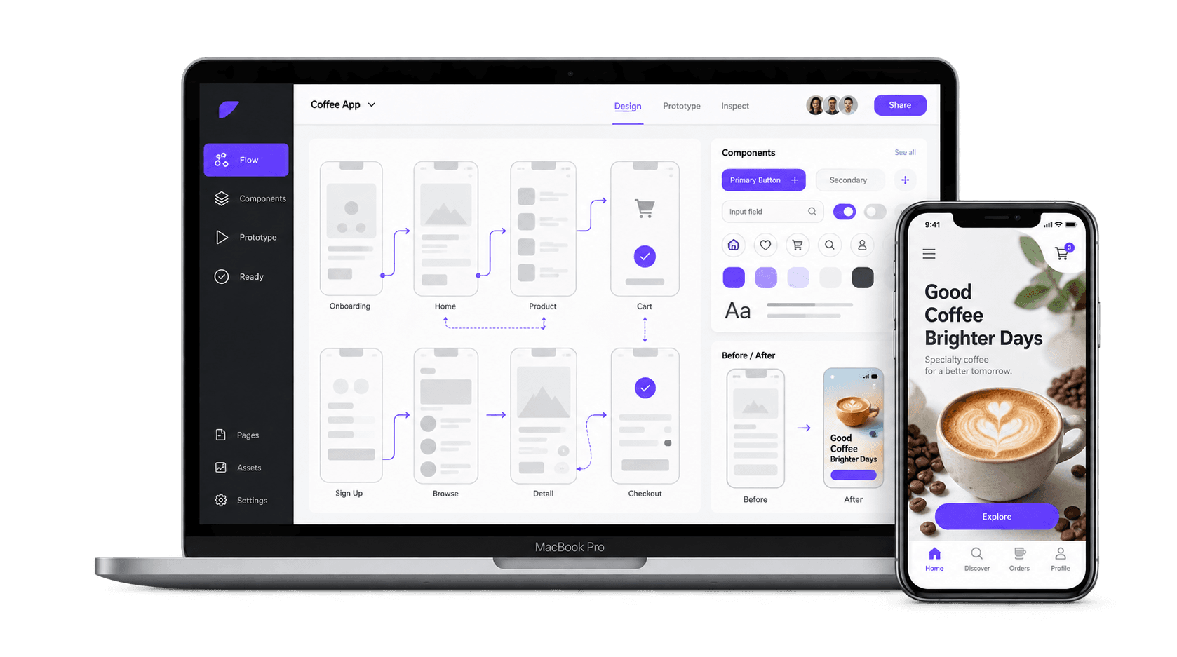
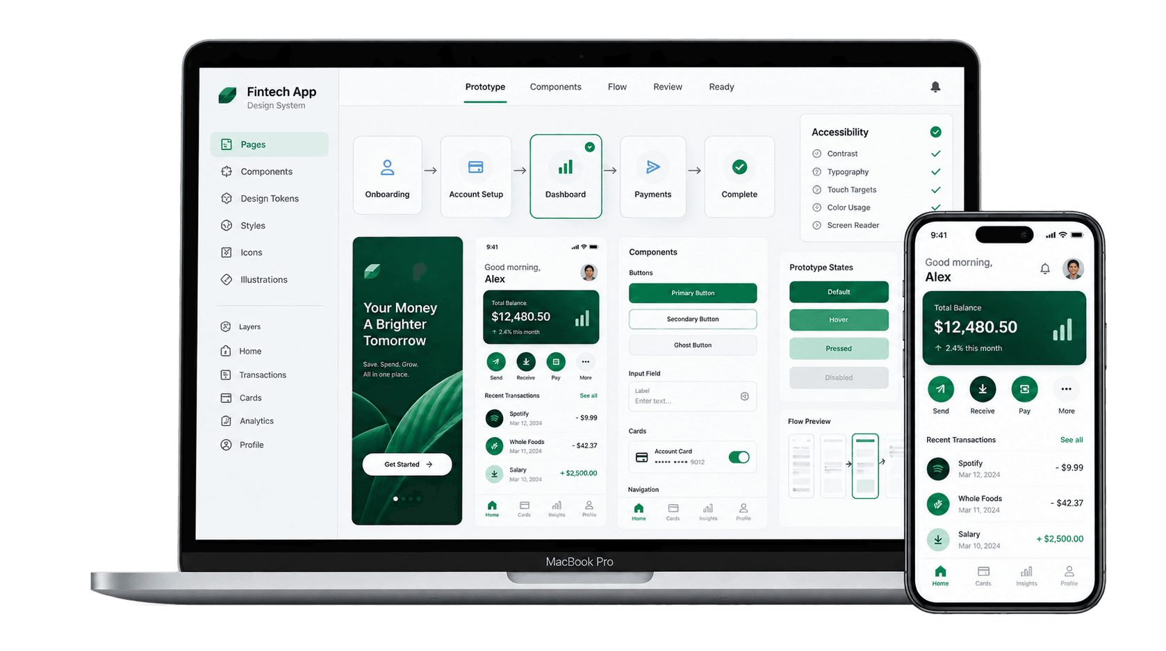
We map the user flow, design the key screens, build a reusable component system, and test the interface before it becomes production code. The result is cleaner decisions, fewer dead ends, and a product that feels planned.
Deliverables
What is included
- 01
User flows
The path from first visit to action, mapped before screens are polished.
- 02
Wireframes
Layout and content decisions made quickly without getting lost in colour.
- 03
High-fidelity screens
Finished desktop and mobile layouts ready for build or handoff.
- 04
Design systems
Buttons, inputs, cards, type, colour, spacing, and states kept consistent.
- 05
Clickable prototypes
The main journey tested as something you can actually click through.
- 06
Responsive design
Screens planned for phone, tablet, and desktop instead of squeezed later.
- 07
Accessibility checks
Contrast, touch targets, readable type, and clear states checked early.
- 08
Developer handoff
Specs, assets, and states organised so build time is not wasted guessing.
Process
How it runs
The same shape every time: agreed in writing first, built where you can see it, handed over in full.
- 01
Map
Users, actions, and the screens they need are written down first.
- 02
Wireframe
Structure is approved before detailed styling starts.
- 03
Design
Key screens and components are built into one consistent system.
- 04
Prototype
The important flows become clickable and are reviewed like a real product.
- 05
Hand off
Screens, states, assets, and notes are prepared for production.
Why it matters
What it changes for the business
- 01
Less confusion
People stay longer when the interface makes the next step obvious.
- 02
Faster builds
A clear component system stops every screen being solved from scratch.
- 03
Feels premium
Spacing, hierarchy, motion, and states are what make software feel expensive.
Start here
Need the product to feel properly designed?
Send the idea, the current screens, or the messy flow. You get a clear scope for the design work before anything starts.
Or email hello@twfoundary.com